-
Web page design: GIF vs. JPEG
普通类 -
- 支持
- 批判
- 提问
- 解释
- 补充
- 删除
-
-
Introduction
WHICH FORMAT TO CHOOSE? It depends on the complexity and range of colors in your image, the picture quality you want, and the optimal download speed. Understanding how they differ can help you get the best possible quality at the fastest download rate.
-
Graphics Interchange Format (GIF)
The GIF compression technique developed by Compuserve is best for:- Images with solid areas of color
- Line drawings or logos
- Transparency effects, in which you designate part of the image to disappear into the background
- Animation

This image was 24K in GIF and 49K in JPEG.


GIF works by compressing blocks of color such as the gray background on the lighthouse or the green shape behind the pager. However, GIFs can only display a maximum of 256 colors.-
Joint Photographic Experts Group (JPEG)
JPEG was designed to compress high-quality images such as photographs and detailed artwork, without sacrificing quality. It handles subtle shadings and color blends more efficiently than GIF.
When saving your image, you can control the amount of compression and the resulting file size. Experiment with different settings until you find the right balance of quality and size. For a rule of thumb, consider that a 36K image will take 10 seconds or longer to download on a 28.8 modem.
If you are using JPEG for a background image on your web page, use the lowest quality setting to get a small file size. This will allow your background to download before the rest of your page.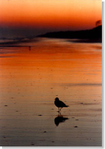
This image was 18K in JPEG and 33K in GIF-
Web palettes and dithering
Do your graphics look grainy when they are posted on the Web? When you create your images, you're probably viewing them on a monitor capable of thousands or millions of colors. That same image viewed on a monitor with only 256 colors is "dithered." The browser tries to approximate the color by using pixels of other colors.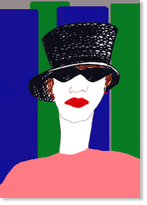
The original graphic. On a monitor capable of thousands or millions of colors, it will appear smooth and flat.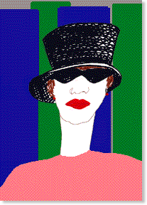
How the same graphic would appear on a monitor capable of 256 colors.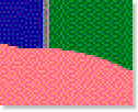
Close-up of dithering
Another source of frustration is creating a beautiful graphic on one platform, only to have it look dark or muddy on the other. You can avoid these image quality problems by using the 216 colors common to both Mac and Windows browsers, referred to as the "nondithering palette." Most graphics software will provide this option although they may call it an HTML palette or Web palette. You can also download a nondithering palette from The Discriminating Color Palette by Lisa Lopuck.
Some dithering is inevitable with photographs because of the inherent range of colors. For example, set your monitor to "256 colors" and note how the photograph of the bird on the beach changes. But for graphics that you create, backgrounds, or text colors, use the nondithering palette for best results.-
More Information
Layout and graphic design:
Web Page Design: Graphic Resources for Non-Artists
Web Page Design: Types of Navigation
Web Page Design: Layout Control
Palettes, transparency and optimizing file size:
Creating Killer Web Sites: Design Tips
Linda Weinman's Definitive Guide to Color on the Web
Preparing Graphics for the Web
Yale Style Manual-
Author
Susan Myrland
-
-
- 标签:
- image
- color
- gif
- monitor
- graphics
- colors
- quality
- download
- web
- design
- jpeg
- page
- vs
-
加入的知识群:


学习元评论 (0条)
聪明如你,不妨在这 发表你的看法与心得 ~